contact.iotcommunication@gmail.com
02462537947
HOME
About
Services
Communication strategy
Digital marketing
Event Production
Creative services
News
CONTACT
contact.iotcommunication@gmail.com
02462537947
HOME
About
Services
Communication strategy
Digital marketing
Event Production
Creative services
News
CONTACT
Home
Related posts
NEWS
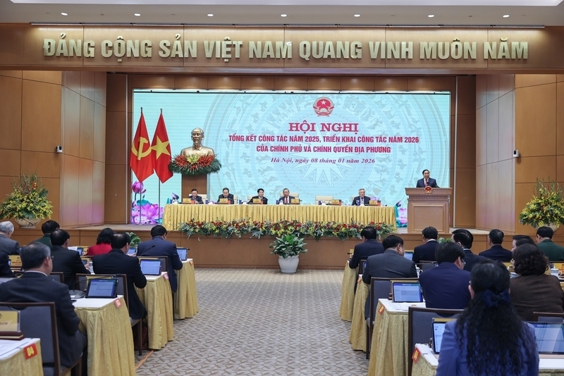
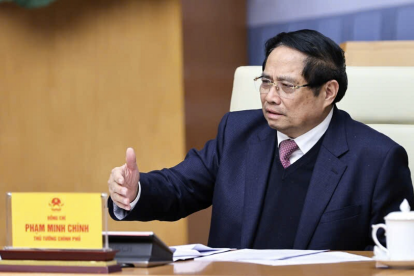
Prime Minister: Double-digit growth links to economic autonomy and resilience
Sa Pa is fastest-growing destination in Asia in 2025
Prime Minister urges clear accountability and resources focus for rail projects
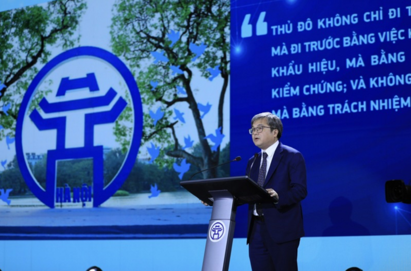
Resolution No.57 and Hanoi’s pioneering choice